Responsive Website Builder for Mobile-Friendly Sites
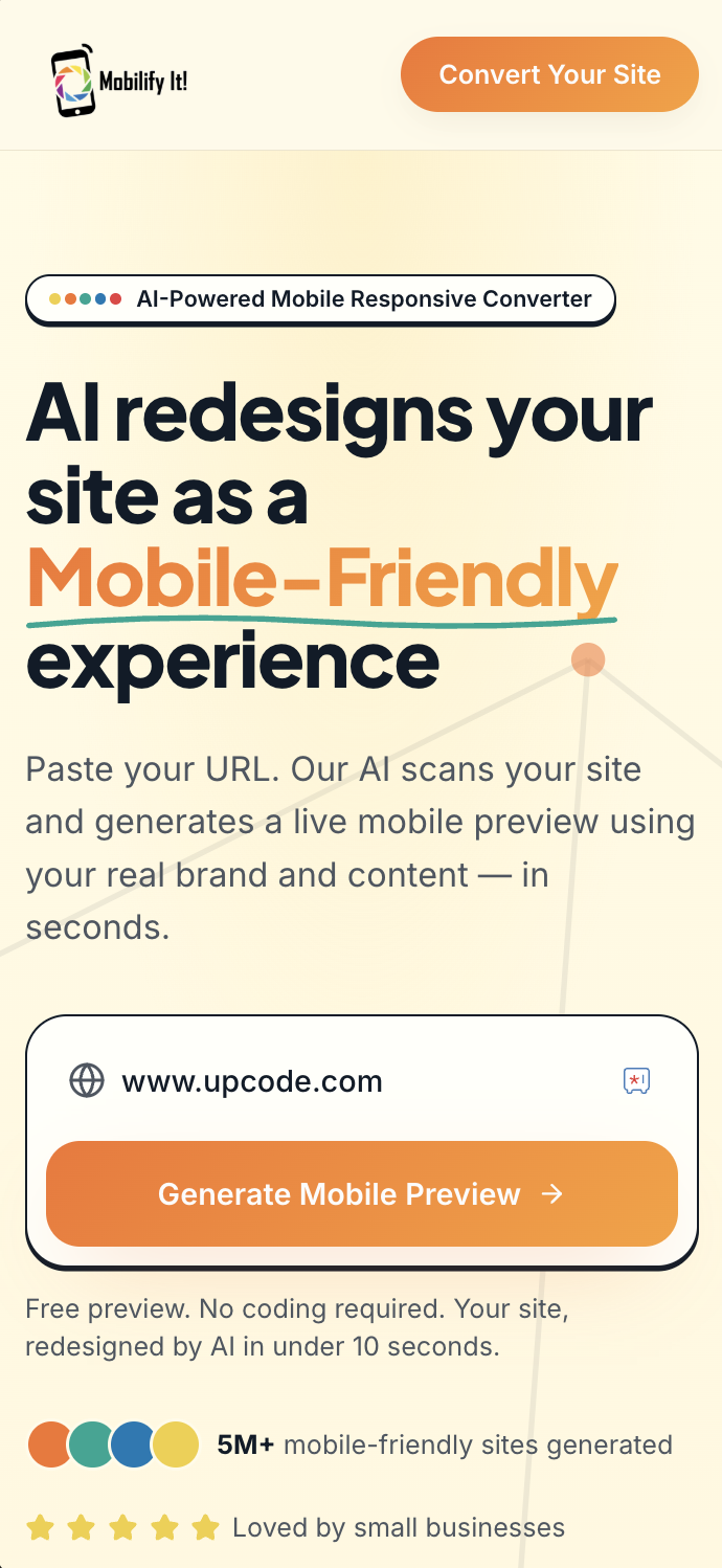
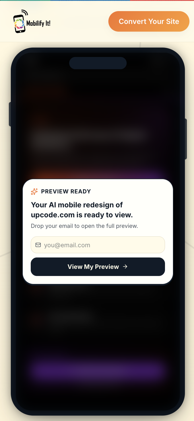
Build dynamic websites without coding knowledge. Mobilify It is a responsive website builder that pairs a no-code editor with a mobile responsive converter, so you can launch a mobile-friendly site fast.

Why businesses choose Mobilify It
- Drag-and-drop responsive editor
- Mobile-first layouts out of the box
- Pre-built business and service templates
- Tap-to-call and contact-form blocks
- Image, blog, and ecommerce-friendly structure
- Convert an existing site or start fresh
What is a responsive website builder?
A responsive website builder lets you create one website that automatically adapts to phones, tablets, laptops, and desktops. There's no separate mobile site to maintain — your design, content, and SEO live in one place.
Build new or convert existing
Mobilify It is unique because it works as both a responsive website builder and a mobile responsive converter. Start from a clean template, or paste your existing URL and convert your current site into a responsive layout you can edit.
Designed for non-technical users
No HTML or CSS required. Choose a layout, edit content, swap images, and publish. The responsive grid handles all the device-specific work for you.